H.K. OSWAL.
Premium Dual-Sided Product Tag: A legacy-driven visual identity system built for a hosiery brand established in 1957.
Project Overview
This project involved designing a premium product tag for H.K. Oswal, balancing vintage aesthetics with professional layout discipline. The objective was to create a print-ready system that reflects brand heritage while maintaining commercial usability.
Brand Positioning
Identity & Trust
Heritage Identity
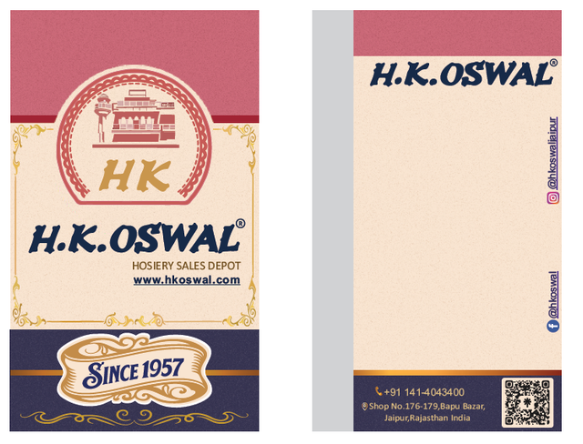
Circular seal-style emblem symbolizing authenticity with a heritage-inspired illustration within the logo badge.
Legacy Positioning
Establishing credibility through 'Since 1957' badge integration and structured color hierarchy (maroon, navy, gold).
Technical Discipline
Meticulous bleed planning and vector ornamental detailing ensuring professional commercial packaging quality.
Technical Discipline
- Circular seal-style emblem & heritage logo badge
- Strong serif typography for premium brand tone
- Gold-toned 'HK' monogram accents
- Proper bleed and safe margin planning
- CMYK-compatible color selection for print
- QR code placement for digital access integration
Outcome
✔ Strong Heritage Branding
✔ Premium Shelf Presence
✔ Clear Typography Structure
✔ Balanced Ornamental Detailing
✔ Commercial Print Readiness